The Intuit Giant represented our technology having your back
Overview
Improving how our customers ask their questions proved one of the most impactful projects of my career, resulting in delighted customers, tens of millions of cost-savings for Intuit, numerous patents and an ACM peer-reviewed paper presented at the Intelligent User Interfaces 2018 conference in Tokyo.
Effective 3-step design with second-search results
Opportunity
In 2017, TurboTax approached our Self Help platform team for help. They were expecting a surge of customers who were no longer eligible for phone support, and they wanted to ensure their success through self-help.
We developed and ranked dozens of concepts, and decided to pursue two high-impact hypothesis:
1. Reducing Duplicate questions in our system will get you your answer faster
2. We can Improve Helpfulness by helping you ask the kind of question that will get answers
Objective 1: Reducing Duplicate Questions
Our research showed that customers searching with keyword strategies often had a hard time articulating their question due to a lack of domain expertise. They would tell us that they didn't want to call, but felt that only an agent could isolate their issue. We also knew that duplicate questions were clogging our system. This lead to fewer authoritative answers, and wasted time searching.
Hypothesis
We believed that if we searched against their intended post, we could find an answer from an existing duplicate question. This would get them their answer fast while deflecting duplicates from the system.
One design challenge was in how to provide these results in a way that customers found valuable, and not as an unexpected detour.
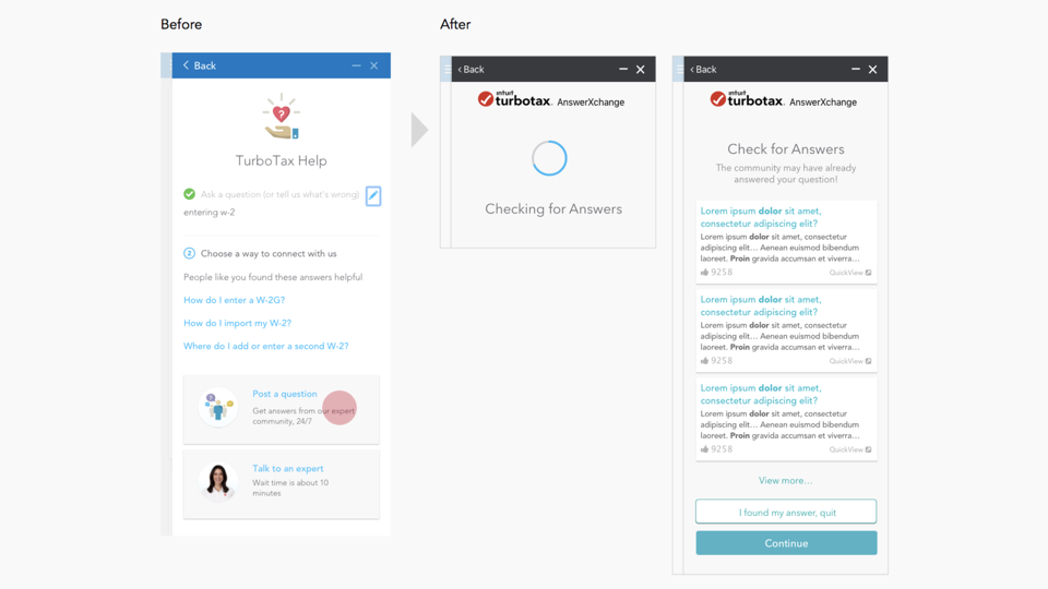
Improving expectations and prominence
Process
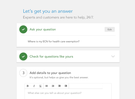
Rapid-prototyping led us to a design that set expectations with a 3-step pattern. The potential duplicates were presented prior to investing time in details, and with a quick-view feature that made it a safe-click. This design compartmentalized the tasks, so customers could focus on finding their answer rather than rushing to post.
FINDINGSBy analyzing the questions that were being posted, I discovered ways that we could improve over the prior design. We observed people thinking they were chatting privately to agents rather than posting to a community, posting queries rather than questions, duplicating their question in the details area, and providing too much, or too little information. The final design set the context for a public Q&A system, and helped customers form effective questions.
Results
The results were dramatic, averaging 50% deflection. This addressed the projected surge in self-help in 2017, and improved both conversion rates, helpfulness rates, and contributor effectiveness. It also reduced escalation to expensive and time-consuming assisted-care.
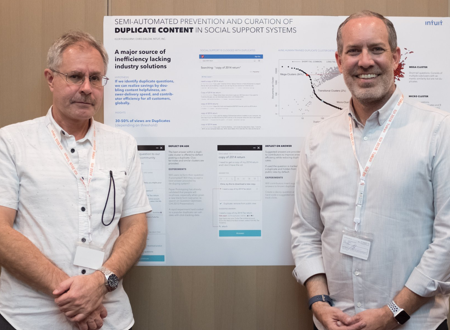
Presenting at ACM Intelligent User Interfaces Tokyo 2018
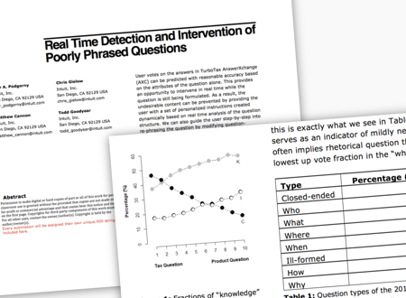
Our ACM Peer Reviewed Article
Objective 2: Increasing Helpfulness with Question Optimizer™
With duplicate-deflection performing well, we moved on to improving the quality of questions. This began with an ad-hoc conversation with my data scientist, who revealed correlations between question and its likelihood of receiving a helpful response.
Hypothesis
Key insights included that closed-ended questions performed best, while why questions performed worst. I saw this as a design opportunity, and we partnered to develop a question-posting experience that provided interactive guidance.
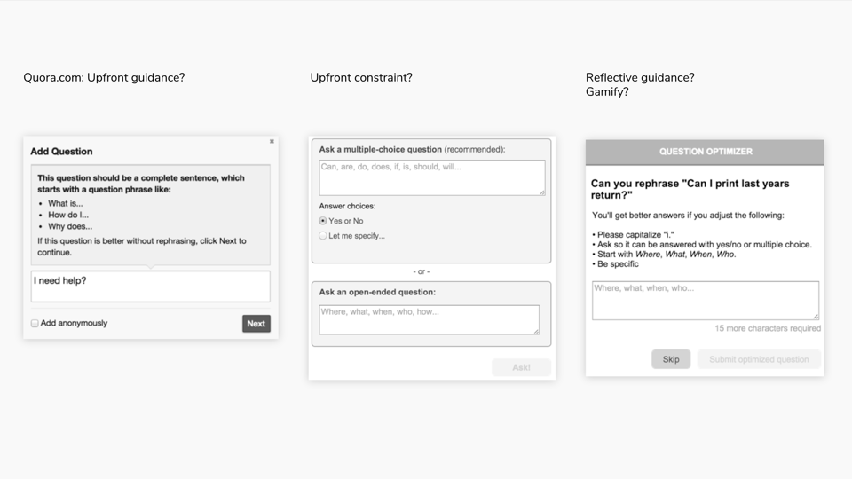
Three potential directions
Process
Secondary research showed that most community sites had open forms for posting. Only Quora.com provided instructions. But they appeared haphazard, mostly just encouraging the use of complete sentences.
We settled on four approaches to test our hypothesis:
1. Baseline: Follow industry convention and provide freeform posting
2. Instructions: We only saw Quora.com doing this, and it was limited
3. Constraints: Constraints and Affordances are considered a usability best-practice
4. Coaching: This was a concept we later added, inspired by our rapid experiments
For our rapid experiment, we used a low-fidelity paper-prototype consisting of tips we would show our test subjects while they were writing a question.
Findings
Users applied our tips, but what surprised us was when we observed that they were even more successful when re-writing their questions from scratch. This led to another innovation: provide the user the option to start fresh after receiving each tip, while displaying their previous attempt as a draft.A medium-fidelity prototype was created (below) that explored how to best score their question, provide tips, and a fresh input box. The goal was to delight the user with value rather than make them feel we were providing unexpected obstacles.

Rapid experimentation with paper prompts
Results
The coaching approach proved most successful, and facilitated gamification and dynamic, personalized tips with each re-write.
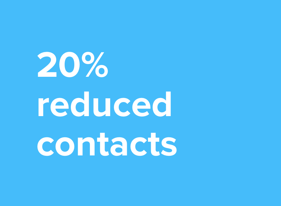
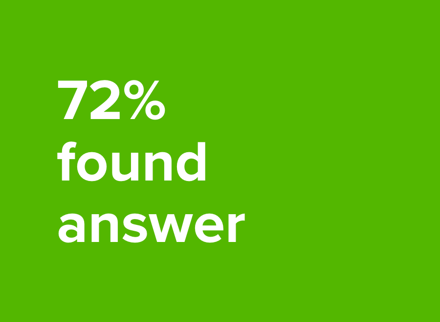
We launched this feature and TurboTax reduced contact-rate by 20%, and deflected over 50% of potentially duplicate questions. The design helped 72% find their answer before posting. All this despite 18% more questions overall for the season.
• 18%+ More questions/season
• +50% Duplicate Deflection
• 20% Reduced Contact Rate
Our innovations led to several patents, and a peer-reviewed article that was presented at the 2018 ACM Intelligent User Interfaces conference in Tokyo.
TurboTax and QuickBooks were eager to leverage the Question Optimizer™ widget. Design refinements continue, particularly in the form of a Conversational-UI, which offers a familiar dialog that's well suited to the nature of the problem.

